Turning Infrared Images into Representative Color Photos


M31-Infrared-s

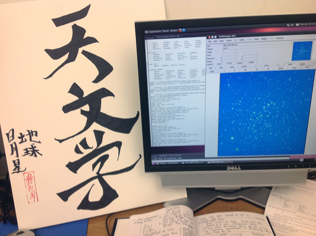
A representative color RGB image of the Andromeda Galaxy (M31) with WISE 2 data in the blue channel, WISE 3 in the green channel, and WISE 4 in the red channel. The blue dots are probably field stars. The bright red areas indicate star-forming regions with lots of dust (heavy on the 22 micron wavelength) whereas the blue ares is heavy in the 4.6 micron wavelength.

 During fall semester, 2014, I taught the first half of a year-long astronomy course. This semester focused on constellations, cosmology, galaxies, and stars, whereas winter semester will focus on planetary science and the solar system.

M16-Lexi B-sharp-s

A representative infrared image of the Eagle Nebula, M16, by Lexi B. You can see the Eagle’s head and beak just to the lower left of the central red “finder” circle.

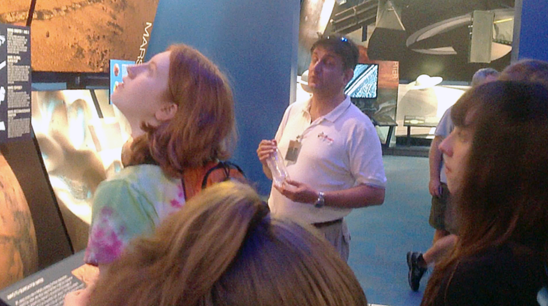
Because of my work at Brigham Young University for the Research Experiences for Teachers (RET) program during the previous summer, I wanted to incorporate what I had learned into my class by creating a series of new lesson plans. Ultimately, I wanted to experiment with these lessons, get student responses to them, and create a poster on their effectiveness to present at the American Astronomical Society conference in January. I would be going there anyway with the NITARP group, so why not present my own educational poster?

Helix Nebula-Wyatt-sharp-s

The Helix Nebula, a representative infrared image by Wyatt B. Notice the long infrared (22 micron) afterglow in the center of this planetary nebula and the shorter wavelength (3.4 and 12 micron) shock wave around it.

Altogether I worked up three lesson plans for this poster, including one on finding the distances to stars using the Distance Modulus formula (I have already published the precursor lesson about using the parallax method), another on using WISE infrared data to create representative RGB images, and a third on how to find data for stars and chart it into SEDs (Spectral Energy Distribution diagrams).

Here is a description of the second lesson. I am also attaching a finished PDF version here:

False Color RGB tutorial

Purpose: To teach high school astronomy students how to use the IRSA Finder Chart in the NASA/IPAC database to locate and download infrared data files from WISE and other missions, then use IR images of various wavelengths to create representative RGB images.

Part 1: Using IRSA to Locate and Download Infrared Images

IRSA is the NASA Infrared Science Archive located at IPAC, the Infrared Processing and Analysis Center at Caltech in Pasadena, CA. Infrared data and images from all United States and some other missions are archived at this location. The URL link is:

http://irsa.ipac.caltech.edu

Missions that have archived data here include WISE, Spitzer, IRAS, 2MASS, Herschel, Planck, Akari, and others. It is your one-stop shopping center for infrared data.

IRSA website

The main webpage for the NASA/IPAC Infrared Science Archive (IRSA). To download WISE or other data, click on the Finder Chart button.

To use IRSA, click on the “Finder Chart” icon/button from the homepage and it will get you to the search engine. You will need to type in the name of the object or its coordinates (right ascension and declination or galactic coordinates), then choose the area of the sky to look at, ranging from degrees down to arcseconds. Then choose the display size (usually you want “large”) and the datasets to retrieve, such as DSS, SDSS, 2MASS, WISE, or IRAS. Then click “Search.”

IRSA search entry

The Finder Chart search engine. Type in the name of the object (it may need to be a technical name, such as Messier 31, instead of the colloquial name) or you can type in the coordinates for the area you wish to view. You can specify which catalogs, such as WISE and 2MASS, and how large of an area of sky, down to 300 arcseconds.

For example, let’s say you want to look up the Horeshead Nebula. If you type that into Finder Chart, then it will tell you it can’t resolve the name. So you would want to find a more scientific name, possibly in Wikipedia. You would find it is also called Barnard 33 or emission nebula IC 434. Now the search engine is able to resolve the name (in other words, it found the data).

Horsey WISE and IRAS

The results for the Horsehead Nebula (IC —) in the IRSA finder chart search. This shows that WISE 1-4 wavelengths as well as the IRAS wavelengths (12, 25, 60, and 100 microns). The WISE mission had much greater resolution.

Using the default size of 300 arcseconds produces only a small part of the nebula, so you will need to increase the area covered by the image, let’s say to 20 arcminutes. We now get good images from DSS, nothing from SDSS, just small images from 2MASS, nicely detailed images from WISE, and very pixilated images from IRAS. You can tell from these that IRAS had much lower spatial resolution than the other space probes, with WISE and DSS having the best.

Horsey RGB-s

The Horsehead Nebula in infrared wavelengths. Notice the bright red star at the top of the horse’s head, which is invisible in the true color image below.

To download the images, click on the Save button (which looks like a floppy disk) in the upper left corner and choose the file type. For using these in Photoshop or Gimp, you will want to choose PNG for the format. If you will be using DS9, then choose FITS format. When the PNG file pops up in your Preview window, you will need to resave it under a better name, such as the name of the object and which mission/wavelength the image is, such as WISE 4 or 2MASS H band. Save them in a folder other than the Downloads folder for easier access.

Horsey true color

The Horsehead Nebula in true color. The dark nebula hides a hot, young protostar that shows up nicely in the WISE image above. The dark wall below in this image becomes a glowing cloud in infrared.

This lesson gives instructions using the menus and commands in Adobe Photoshop, but you can use GIMP instead, an open source program that is free for download. The instructions/commands are similar.

How Computers Handle Color – And What is Meant by a “Representative” Color Image:

Computer images are made up of three “channels,” which are images made of 256 shades of gray (in 8 bit color, which is 2^8 colors or 256). Each channel is an additive primary color: red, green, or blue. If you don’t know what I mean by an additive color, please do a Google search and look it up. All I want to say here is that color on a printed page is subtractive – as you add more pigments, the image gets darker as more light is subtracted. The primary colors are the colors of pigments: cyan, magenta, yellow, and black. But the image on a computer screen adds light to light, and so the primary colors are red, green, and blue. Red and green together make yellow. All three together make white.

Pasting in Green channel-s

The channels palette in Adobe Photoshop. By selecting and copying a narrowband image (say WISE 3 at 12 microns) and pasting it into only one channel (here the green one), three separate narrowband wavelengths can be built into one representative color RGB image.

The process here is to take three 256 grayscale infrared images at increasing wavelengths (such as WISE 1, 3 and 4) and use them to replace the blue, green, and red wavelengths respectively. The final image is not true color but represents the original invisible infrared wavelengths with colors our eyes can see.

Part 2: Combining Images in RGB

You will want to open Adobe Photoshop and choose “File-Open” and open three of the four WISE images or all three of the 2MASS bands. For WISE data, I recommend either the WISE 1 or 2 (3.4 or 4.6 microns) for the blue channel, WISE 3 (12 microns) for the green channel, and WISE 4 (22 microns) for the red channel.

Start with the WISE 1 or 2 image as your starting point. Choose “Image-Mode” and convert the photograph to RGB with 8 bits per channel. Then click on the WISE 3 image and select all of it (Command-A), then copy it (Command-C). Go back to the WISE 1 or 2 image and open the Channels window. Click on the green channel only, and paste in the WISE 3 image (Command –V). The WISE 3 image should now only appear as a grayscale image in the Green channel of the WISE 1 or 2 RGB document.

All channels in-negative

All three of the wavelengths are now combined as separate channels. However, since astronomical images are usually inverted (space is white and stars are black), we have to invert the image here.

Click on the WISE 4 image, select all of it and copy it, then go back to the WISE 1 or 2 image, go to Channels, select the red channel only, and paste in the WISE 4 data.

This will give an RGB image with the three wavelengths superimposed as the blue (WISE 1 or 2), green (WISE 3), and red (WISE 4) channels. This image will be inverted, so go to “Image – Invert Image” to have black as the background space color.

You may want to make some lighting adjustments (Image – Adjustments – Levels) and increase the resolution and dimensions of the image (Image – Image Size).

All channels postive

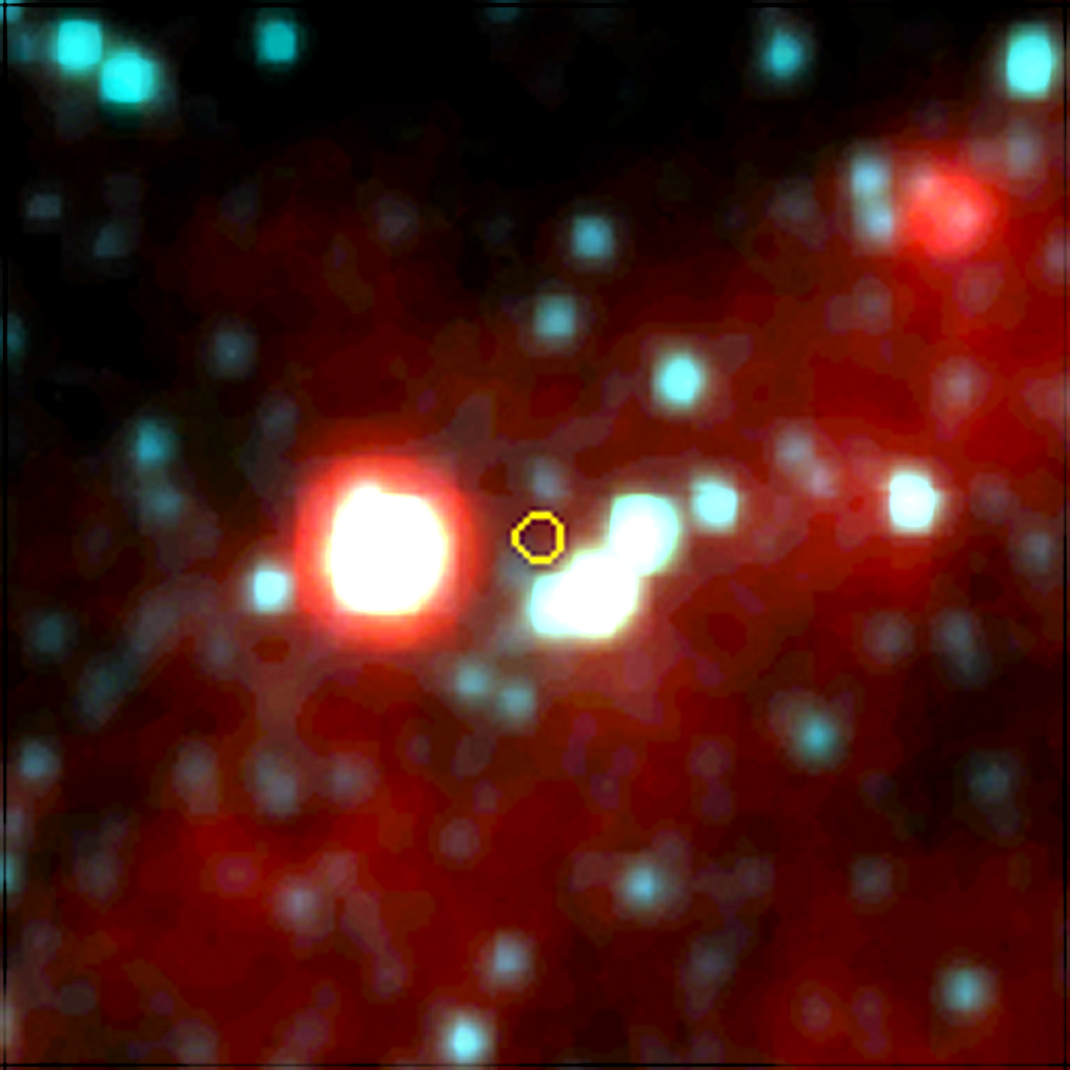
All the channels combined and the colors inverted so space is black. This is an image for one of our HG-WELS stars, where the IRAS data had source confusion (a grouping of stars “spoofed” the IRAS sensors). The actual target K-giant star is the one to the left of the red finder circle.

Save and rename the image so you know it is RGB. Then pat yourself on the back. You’ve done it. Or better yet, do another one.

m16eagle-Dave M-enhanced-s

Another view of the Eagle Nebula, M16, in representative infrared colors, this time with a larger view area. This was done by Dave M.

Posted in Uncategorized | Tagged , , , , , , , , , , , , | Leave a comment

BYU-RET Final Weeks


BYU grad luncheon

Graduation luncheon at the Eyring Science Center at Brigham Young University in August, 2014 for the College of Physical Sciences.

Upon completion of my trip to Caltech with my NITARP students, I resumed my studies at Brigham Young University for the remaining two weeks of my Research Experiences for Teachers (RET) program.

Combined N-W charts-labels-f

The same chart with regions labeled. Four open clusters are compared by H-alpha index and absolute magnitude. NGC 663 stars are magenta, NGC 659 stars are blue, NGC 752 stars are green, and M67 stars are red. Be stars are in the upper left, the main sequence is the orange curve peaking at A0 stars, the cool star red giant branch is the yellow area, the hot star red giant branch is the magenta area, blue stragglers are light blue, and field stars are light green.

Before the Caltech trip, as documented previously, I had charted four open clusters of various ages using a hydrogen alpha index. This color-magnitude diagram (CMD), once calibrated for distance, showed some interesting results. I was able to pick out the expected number of Be (B emission) stars in the younger clusters, see a well-defined turn-off point for three of the four clusters including blue stragglers, pick out the background field stars from the cluster stars, etc. It was the culmination of seven weeks of work involving learning how to use and chart data from IRAF, DAOPHOT, and DS9 software.

But my goals for this research were far from over. Now that I was back at BYU, I wanted to focus on learning other astronomy software such as AstroImageJ for doing other types of tasks. I wanted to learn how to chart the variability of stars, create Spectral Energy Distributions (SEDs), etc. I started with the SED because I had just learned how to do these at Caltech. I choose my old friend V*V831 Cas as a target star because I had good data for it over many nights from the BYU West Mountain 36 inch telescope.

SED for V831 Cas

Spectral Energy Distribution (SED) for V*V831 Cas. The peak is somewhere in the yellow-orange part of the spectrum (V stands for “Visible” or green, not violet). The hump in the WISE data probably indicates a ring or disk or dust surrounding this HMXB star. I don’t know what’s going on with the W4 reading – I might have a bad calculation or other anomaly there.

It was easy enough to look up the star’s magnitude information at the infrared wavelengths using 2MASS and WISE data, since I knew how to find it and feed it into the same spreadsheets I’d used last week. But I wanted a larger Wien curve, including the U, B, and V filters. This was a Be star, and I expected its flux densities to peak in the B or V part of the spectrum, so I needed those magnitudes as well. I looked them up in the SINBAD database, but had to find their zero points (compared to an A0 star) in order to convert them into flux densities. This took some research, and I’m still not sure I got the right values, but it did make a nice enough curve. It did not peak where expected, however. It peaked somewhere in the yellow-orange part of the spectrum.

According to the curve, V*V831 Cas also has a hump-shaped infrared excess between WISE 1 (3.4 microns) and WISE 2 (4.6 microns), which could indicate a ring of dust surrounding this star. As it is a High-Mass X-Ray Binary (HMXB) star, I would expect a ring or accretion disk of dust and gas as material is pulled off the B star onto the black hole or neutron star in this binary system.

V831 variability-Excel computed

Light curve for V*V831 Cas, To fit the data, Excel had to use a fifth order polynomial with a large difference in amplitudes. The average period is about 97.5 days.

Next, I read through the instructions for using AstroImageJ and used it to create a chart of V*V831 Cas’ variability. To do this, you read in the .fits files from each night of NGC 663 that I had data for. You then choose up to ten comparison stars (which should NOT be variable stars) around the target star on the first image, then run the images through making sure the comparison and target stars are all kept within the frame of the image, then track each star if there is movement from frame to frame. The comparison stars allow the software to adjust for differences in viewing from night to night. Once all the frames are entered, the results for the target star are placed in a spreadsheet with magnitude values versus Heliocentric Julian Dates. The data can be exported to an Excel spreadsheet, then charted into a curve such as the one shown here. For Excel to fit a curve to my data required a fifth-order polynomial.

V831 variable curve-estimated

My own attempt to fit the data to a curve. This has a more regular amplitude but the period calculated (84.5 days) appears too short compared with the AAVSO data.

I looked up the star in the American Association of Variable Star Observers database. The website has a function that can generate light curves using available data for a star. I used one and plotted what appeared to be the maximum points and estimated the period of its variability at about 105 days. Looking at the Excel generated chart gave me a period of 97.5 days, so pretty close for the minimal data I have available (only about two and a half periods and some of it sketchy during poor viewing months). But one thing about the Excel curve still bothered me – it seems to have too extreme of an amplitude change. I attempted to plot my own curve using the same magnitude points and came up with a curve that had a more consistent amplitude, but a period of only 81.2 days, which isn’t very close at all to the AAVSO data.

AAVSO chart of V831 Cas

Light curve generated automatically from the American Association of Variable Star Observers’ website. This showed available data for the last year and indicates a period of about 105 days (ignoring the missing data on the right). This corresponds better with the Excel calculated period than my own estimate.

One thing is certain: I need more data to see if my calculated period agrees with further AAVSO data. I suppose that is always the case. One always needs more data. To draw any real conclusions, I would need to observe V*V831 Cas for several years in order to get several periods. We tend to think of most scientific studies as being founded in deep sets of consistent long-term data but it isn’t often that way. You have to make do with what data you can get, and hope you did a good enough job gathering the data, calibrating your instruments, and using solid statistical tests. If all that is true, you can at least draw some tentative conclusions and hope further evidence supports your analysis.

V831 Cas-10 year variability

When I expand the AAVSO search to the last ten years, a more regular pattern emerges showing that V831 Cas has a period of about 143 days. However, my own calculations showing a 97.5 day variation might indicate there are patterns on top of patterns, which can occur in such a dynamic binary star system. Keep in mind that the black hole or neutron star and the visible Be star are orbiting each other in elliptical orbits while material is being pulled off the B star into an accretion disk around the black hole. The accretion disk itself has a period as do the co-orbiting stars.

During my final week at BYU, I had only three days to write up my final presentation and present it to the REU students and physics professors. They only provided 20 minutes per presentation, so I couldn’t say much and focused on my new work since returning from Caltech, and what conclusions I could draw from my efforts. I still have much I want to do, but I feel I’ve accomplished a lot for one summer. I am attaching a PDF copy of my final presentation here:

BYU final report-s

Now I must turn my attention back to my own astronomy class at Walden School this fall and how to integrate what I have learned. I hope to create several lesson plans and activities that I can present at the American Astronomical Society conference in January as an educational poster, since I will be there already with NITARP. I will have my astronomy students try these lesson plans out and make modifications. Dr. Hintz provided me with an entire hard drive full of images taken with the 36-inch telescope on West Mountain that have not been analyzed. I hope my astronomy students can make use of the data for science fair projects.

BYU REU students

Some of the REU students at BYU during the summer of 2014. Olivia Mulherrin is the lady smiling on the right side. This was the banquet on the last day of our program.

On our final day, which was also the summer term graduation exercises for BYU, we attended a nice reception luncheon put on by the Physics department for graduates and their families. Now the other REUs go back to their own universities to share what they’ve learned. I go back to school. Our contract days begin next week, and I’ve already begun to organize my room.

Since one of the three RET teachers didn’t complete his program, the available grant money will be split between the two of us remaining. I will get $1600, which I hope to spend on a new telescope. Hopefully I can use it for astrophotography, although a decent motorized equatorial mount and a CCD camera will be much more than $1600. At the very least, I can get a good Dobsonian mounted reflector. I look forward to finally having my own telescope.

Posted in Uncategorized | Tagged , , , , , , , , , , , , , , , , , | Leave a comment

NITARP Days 5-6: What We’ve Learned


Santa Monica Pier-s

A panoramic photo of the Santa Monica Pier on August 2, 2014.

For our final day at Caltech for the NASA/IPAC Teacher Archive Research Program (NITARP) we drew conclusions from our research and evaluated how much we’ve learned from the process.

Caltech campus

Part of the campus at Caltech.

Our main goal, besides learning how to use the IPAC infrared astronomy database, has been to research K-giant stars that may be consuming their own planets. When a main sequence star starts fusing helium in its core and expands outward, its inner planets may be ingested. Our own sun will go through this process in about five billion years, and it will expand outward almost to the orbit of Mars. Earth will be destroyed in the process.

Sundial at Caltech

A sundial at Caltech campus.

Our question has been, is there a way to determine if a star is going through this process? What evidence would there be in the star’s light, which is the only thing we can measure? Some of these young K-giants show anomalies, such as high levels of lithium and faster than expected rotation (stars should slow down as they expand). One explanation for this is that the lithium and increased angular momentum could be provided to the star from a planet as it is absorbed. So what evidence would be left behind that we could see? Perhaps the planet would leave behind a shroud of dust or gas that would become a shell or ring around the star. Such a star would show an excess amount of infrared radiation compared with a normal star, because dust and gas emit in the infrared bands (and the WISE mission’s 12 and 22 micron detectors are designed specifically to measure gas and dust). So, to make a long abstract shorter, we are looking at K-giants that are already known for high lithium abundances and fast rotation to see if they also have an infrared excess.

Sundial plaque

How to use the sundial at Caltech.

We found five stars from this preliminary database (derived from previous studies by de la Reza et. al, Jolene Carlberg, etc.) that meet all three criteria. I reported on these results and how we got them in my last post. So what can we conclude from these results? First, we hoped to find more than this. However, it isn’t necessarily a negative result – it could well be that a planet breaking up would leave a shroud or ring for only a very short time period before it dissipated or clumped back together. So finding five stars out of 180+ on our list that have this feature is actually pretty good. Perhaps our parameters have been too strict – maybe we should look at chi values less than 2.5 (2.5 standard deviations puts 95% of data below that threshold, so being above that level is considered “significant” in most scientific circles). At what point do we consider infrared readings to be in “excess” of normal? How much is too much for it to be a star at all?

Post Office at Caltech

A post office at Caltech. Notice the commemorative stamps honoring some of the Nobel Prize winning scientists that have taught here. I have interviews a man (Reed Nixon) who went to school here when Robert Milliken was President and took chemistry from Linus Pauling. The Von Karman Auditorium and Museum at JPL is named after Theodore von Karman.

We discussed all of these issues during this last session of our workshop. Dr. Rebull stayed away from this session on purpose, to make sure our conclusions were our own. As teachers, we had planned on ways to evaluate the students’ learning. I had proposed creating a pre-post test instrument, but due to concerns about privacy and school policies on research involving students, we decided instead to have the students show what they learned by dividing them into cross-school groups and drawing concept webs, then explaining and expanding them to the others. We will do the same in two months to see how many of the concepts they retain.

A concept web developed by students on our last day at Caltech for NITARP.

A concept web developed by students on our last day at Caltech for NITARP.

The concept webs I’m displaying here show a rich interconnectedness of ideas and concepts. One of the ideas we discussed was the standard emission curve a blackbody object would radiate. Stars approximate this curve, which is what Wien’s Law is all about. Our project compared our target stars to this blackbody curve. To help the students understand this concept, I had made a joke about my body being a Black body (that is my name, after all). For some reason, all the groups remembered that particularly horrible pun and linked my name to “blackbody.”

Another concept web done by students during our workshop at Caltech. Notice the link from "blackbody" to my name. That's what I get for telling bad jokes.

Another concept web done by students during our workshop at Caltech. Notice the link from “blackbody” to my name. That’s what I get for telling bad jokes.

During the afternoon as we were winding down, I walked over to the gift store at Caltech and took a few more photos of the campus. I bought two Curiosity rover Matchbox cars and a knit Caltech cap. We wrapped up in the early afternoon and ate supper in Old Town Pasadena again. We said our goodbyes for now, knowing we would be communicating back and forth all fall as we prepared the abstracts and posters, and that we would see each other again at AAS in Seattle in January.

Santa Monica Pier and beach on August 2, 2014.

Santa Monica Pier and beach on August 2, 2014.

The other teachers had flights in the early morning on Saturday (a few of the students were staying over with family or flying out Friday night), but I had deliberately set our flight in the afternoon so we could go to the beach in the morning. We packed our things in the rental SUV and drove out to Santa Monica Pier, finding parking for $10 on the beach itself. It was early enough that the traffic wasn’t too bad and there was still room in the parking lot, even for a Saturday morning in August. The weather was nice and the water cool. I didn’t put on my swimsuit, but the students did and had a good time.

Rides and colors on Santa Monica Pier.

Rides and colors on Santa Monica Pier.

We met up after two hours and changed back. By this time the beach was beginning to get crowded and we were getting sunburned, so it was time to go. We drove down the Harbor Freeway toward the airport and exited to find a gas station so we could fill up the tank before dropping off the SUV at Hertz. The station we found was right across the street from Randy’s Donuts, an icon in the LA area. I’ve seen photos before, but never had been here, so we all went over and bought donuts. They were amazing!

Santa Monica beach as seen from the pier. The usual summer haze fades away the Malibu Hills.

Santa Monica beach as seen from the pier. The usual summer haze fades away the Malibu Hills.

We dropped off the SUV and shuttled to the airport, then worked through security to the terminal. While waiting for our flight, we all got cell phone notices that the flight was delayed two hours, so we had to hang around longer. I got some money out of the ATM so we could all get lunch. One of my responsibilities has been to keep all the receipts for reimbursement. NITARP pays for two students and one teacher, but we had three students. We were given a per diem for meals, and I was able to stretch three per diems to feed four people.

David Black on Santa Monica Pier looking back at the beach; August 2, 2014.

David Black on Santa Monica Pier looking back at the beach; August 2, 2014.

We reconciled all accounts and I got all the receipts from the students for their meals. Then the airplane was finally ready, so we boarded and flew out over the ocean, then turned and headed back to Utah. My wife met us at the airport and we drove the students back to Walden School, where they were met by their parents. So ends the first phase of our NITARP experience.

Randy's Donuts near the LAX airport. They're very tasty!

Randy’s Donuts near the LAX airport. They’re very tasty!

Posted in Uncategorized | Tagged , , , , , , , , , , | Leave a comment

NITARP Day 4: Digging Into Data

Walden studs at Caltech sign-s

David Black and students from Walden School of Liberal Arts at Caltech in Pasadena, CA: July, 2014.

On Thursday, July 31, 2014 my students and I continued our NITARP (NASA/IPAC Teacher Archive Research Program) experience at Caltech. Today we dug deeply into the K-giant data and converted the magnitude data at various wavelengths for our target stars into flux densities. We took the spreadsheet of stars Dr. Luisa Rebull had built and created the necessary formulas to do the conversions and calculations, then charted SEDs (Spectral Energy Distributions) of the 180 + stars in our list. I explained the process for doing this in my last post, when we practiced the process with five stars. Today we charted all of them.

NITARP 9-flux densities

A page from my astronomy notebook written at Caltech. It describes how to convert magnitude data for stars into flux densities in photons per centimeter squared per second for various wavelengths.

We also cross compared the fluxes at different wavelengths, such as comparing all the stars’ fluxes at 3.4 minus 4.6 microns, or J minus K, or 12 minus 22 microns. These differences were charted into color-color diagrams (CCDs) and color-magnitude diagrams (CMDs). I had been doing similar things in my BYU research over the summer, comparing hydrogen alpha narrowband with hydrogen alpha broadband to get a CMD for open clusters in Cassiopeia. Just like the Be stars that were isolated far to the left in my diagram, we were looking for outliers to the right of the main grouping of stars. These would indicate infrared excesses and be the stars we would want to explore further.

NITARP 10-CMDs

Notes on how to interpret color-magnitude diagrams (CMDs) for our data. The WISE mission chose four wavelengths (3.4, 4.6, 12, and 22 microns) to study for very specific reasons. These wavelengths are able to detect dust, gas, near-Earth asteroids, galaxies, brown dwarfs, and other objects that give off specific infrared signatures. Our CMDs are meant to isolate the K-giant stars we are studying from other types of objects such as galaxies and brown dwarfs while showing which stars have real infrared excesses.

Allow me to explain. When an SED is developed, it compares the logarithms of the wavelengths (horizontal axis) versus the logarithms of the flux densities (photons per square centimeter per second hitting the sensors of the WISE or IRAS or 2MASS detectors) at each wavelength. Logarithms are used since the differences between the wavelengths on the missions we’re looking at would produce an exponential curve otherwise, which is hard to analyze. Logarithms turn exponentials into straight lines. Now, on a K-giant SED, the flux density will peak in the orange part of the spectrum (hence the name K-giant). From there on through the red and infrared, what is called the Raleigh-Jean side of the Wien’s Law curve, the line is basically straight (or has a constant slope). So when we take the flux density at say 22 microns and subtract it from the flux density at 4.6 microns for a normal star, the change in slope is zero. This is what we chart, basically, in a CMD. Now it’s a bit more complex than this – really, we use the calculus chain rule and so on. John Gibbs tried to explain this to me, but my calculus is so rusty I doubt I could even do a simple derivative these days.

NITARP 7-real science

Some of my notes during the Caltech visit. Our goal: to create a poster for the AAS conference. But as these notes say, even negative results are useful for science. We found only five stars from this initial pass at the data that match our criteria, probably not enough to draw conclusions from. But with further data and more detailed analysis, perhaps a paper in a refereed journal may be possible.

The upshot of all this is that a normal star with a straight Raleigh-Jean side will show up on a CMD chart near zero. Anything to the right will not be a normal star. Too far to the right and it may be a galaxy (it would be at the bottom right in the CMD) or some other non-stellar object or post-asymptotic branch star (very old orange giant). We were studying young K-giants, just beginning to expand and perhaps consuming their inner planets in the process. So we were looking for a group of stars in the CMDs to the right of the main bunch between about 2.5 and 7 standard deviations from the mean of zero for our chi values. These target stars show more flux at the longer infrared wavelengths than they should have, or, in other words, they have an infrared excess. Yes, we can eyeball an SED and say that it looks like we have a hump or an arm, but these CMDs turn the differences into real numbers we can analyze.

Total Excel star sheet

The whole shebang! This is part of our final Excel spreadsheet with all the calculations that convert the magnitude measures into flux densities, then calculates various Color-Color differences for making CCDs and CMDs. The final two columns (pink and green) calculate the significance of the differences using a Chi test for signal over noise. Those between 2.5 and 7 chi values from the mean are in our target range. The question marks are for those with too large of a chi value.

The end results of all this number crunching (remember, we were looking at about 180 + objects originally, but had eliminated many as being non-stellar) were finally revealed: we had maybe five K-giant stars in our list that fit the criteria of having an infrared excess, a high abundance of lithium, and faster-than-normal rotation. We were hoping for many more. Five doesn’t seem like enough to draw any conclusions.

CCD with marked stars

Color-color diagram (CCD) with all the sources in our list. Normal stars are grouped at the zero-zero area of the diagram. The ones marked with red Xs are too far out to be stars at all. The non-X dots are objects of interest to us. They are stars with infrared excesses that may have consumed their own planets.

OK, that might seem to be disappointing. All this work for only five viable candidates. But as my notes from the day say, in science most results are negative or ambiguous. Even these results have value – they tell us what didn’t work or what needs to be clarified before we try again. Science textbooks make it seem that science is one unbroken string of right answers, but that is far from the truth. If all science ever had were right answers, there would be no cause for scientific revolutions that overthrow the status quo. It’s when the answers don’t make sense or our expectations prove wrong that progress is really made, as long as we stick with it and keep experimenting despite lack of results.

CMDs with iffy stars

Color-Magnitude Diagrams comparing 3.4-22 microns and K-22 microns. The grouping of stars along the zero point is what one would expect for normal stars without infrared excesses. All the star to the right show high IR excesses. The ones circles are non stars, iffy, or just plain weird when looking at their SEDs. The ones to the upper left are based on data that has upper limits but no definite values. Our objects of interest are the uncircled dots and X’s to the right of the main group. These have IR excesses that fall between 2.5 and 7 chi values away.

We have proven one thing, which is that the older De la Resa paper using IRAS data was inaccurate in light of the better WISE and 2MASS data. We found a lot of source confusion, non-stellar objects, and various other problems due to the low resolution of the IRAS data. As for the stars provided by Jolene Carlberg, perhaps if we can add in more K-giant stars, or look further at our data and eliminate noise and errors, more viable stars will emerge and we may yet get a paper out of this. One issue we have to resolve is that some of the data was listed as limits instead of definite values. We also need to search the SINBAD database and elsewhere to find out more on these questionable objects. But for now, we have learned a great deal and done our small part to advance astrophysics. We at least have enough for a scientific poster for AAS. Tomorrow we will work on the educational poster by evaluating how much students have learned.

Elena and Kendal with Luisa

Elena and Kendall with Dr. Luisa Rebull at Caltech, calculating flux densities for K-giant stars in our study using WISE and 2MASS data.

As for my students, they did fairly well today. I helped Rosie work through the spreadsheet issues and conversions. Kendall and Elena worked with some of the other students and with Dr. Rebull to understand the flux density conversions and the color-color diagrams.

Rosie and Elena work on SEDs

Rosie and Elena working on SEDs at Caltech for our HG-WELS study.

We went to lunch as teachers to discuss plans for our educational review tomorrow while the students went to different restaurants and diners around Caltech. Rosie went to the restroom just as we were leaving for lunch but didn’t tell anyone, so each group of students assumed she was with one of the other groups and she got left behind. She called me after I had walked over a mile away, so I had to hoof it back to Caltech, then walk with her until I found some students at a diner nearby. It was a hot day and I was pretty sweaty by the time I got back to the other teachers.

HG-WELS Caltech-s

The entire HG-WELS (Hungry Giants-WISE Excess Lithium Study) group at Caltech: July, 2014.

After we finished for the afternoon, we gathered by the Caltech main sign for group photos. Here are photos of the whole group and of my students and I. We ate supper in Old Town Pasadena again. Teachers ate at an Italian restaurant I had eaten at before when I came down for the Curiosity landing conference. We also got some excellent gelato.

Colorado Blvd

HG-WELS teachers in Old Town Pasadena on Colorado Boulevard.

Jordan and I

My son Jordan and I during my visit to Caltech.

My son Jordan lives in Los Angeles and works for a video rental company that specializes in renting cameras to production companies for filming reality TV shows. He is their Lead Technician, and is an expert at all types of video and audio equipment. He met me at the Comfort Inn and we went out to dinner together at BJ’s Restaurant and Brewhouse in Arcadia. It was my second supper, but the food was excellent. I’ve been here before, having stayed several times at hotels in the area, including the Embassy Suites Hotel across the street when I was the Educator Facilitator for the NASA Explorer Schools program at JPL. We talked about his work and his new camera and how he liked southern California. It was good to see him again. John took some photos of us on my iPad when we got back to Pasadena.

Posted in Uncategorized | Tagged , , , , , , , , , , , , , | Leave a comment

NITARP Day 3: Return to JPL, Wien’s Law, and Griffith Observatory

Technicians assemble and test the SMAP (Soil Moisture Active Passive) probe inside the large clean room at the Jet Propulsion Laboratory.

Technicians assemble and test the SMAP (Soil Moisture Active Passive) probe inside the large clean room at the Jet Propulsion Laboratory.

On Wednesday, July 30, 2014, our second day at the NITARP workshop at Caltech, we accomplished three major things. First, we traveled to the Jet Propulsion Laboratory for a tour. Second, we began to wrap our brains around the calculations necessary to create the Spectral Energy Distributions (SEDs) for our target K-giant stars. Third, we visited Griffith Observatory.

I have been to JPL many times, and it is always a thrill to me. I consider it to be the coolest place in the world. Call me a nerd or a geek, but that’s how I feel. Certainly the IQ density of the planet peaks here and at other NASA facilities. When I visit here, I can’t help but be excited by the projects I know are being developed: space probes and mission instruments which will expand our knowledge of the universe and make fundamental new discoveries. But for the first time in all my work here, I am finally bringing students to share the experience with me. I wish I could bring a whole class down. Maybe some day. For today, I contented myself with experiencing this place through the eyes of my students. Kendall, Elena, and Rosie had heard some of my stories, but now they got to see what I had enthused about so much.

Students from the HG-WELS group walking with Dr. Varoujan Gorjian at JPL.

Students from the HG-WELS group walking with Dr. Varoujan Gorjian at JPL.

We drove past La Cañada High School to the front gate of JPL and showed our IDs, then parked in the main parking lot. It was early enough that we were able to find parking places in the shade (not an easy thing). We walked to the visitor office to get our badges and to wait for Varoujan Gorjian to arrive, who would be providing our tour. He is the leader of the other NITARP teacher group and works mostly at JPL.

This is a mock up of the Curiosity Rover (Mars Science Lab) now on Mars. It is in the lobby of the 180 Administration Building at JPL.

This is a mock up of the Curiosity Rover (Mars Science Lab) now on Mars. It is in the lobby of the 180 Administration Building at JPL.

We walked across the courtyard and main square to the Administration 180 building, where Dr. Gorjian showed us the scale model of Curiosity, the Mars Science Lab, in the lobby. I pointed out to my students that this was the place, in the conference room just around the corner, where I had gotten neodymium magnets stuck up my nose (long story – it was hilarious and rather painful at the same time). Last time I was here, in August 2012, this model was out in the courtyard under a tent along with models of the MER and Mars Pathfinder so that the press could take action shots during the Curiosity landing.

The test bed for the InSight Mars Lander at the In-Situ Instruments Lab (ISIL) at JPL.

The test bed for the InSight Mars Lander at the In-Situ Instruments Lab (ISIL) at JPL.

We walked down to the In-Situ Instruments Lab (ISIL) and climbed upstairs to the visitors’ gallery where we could look down on the tests. A test model of the new InSight mission, which will be launched to Mars in March 2016, as well as test beds for MER and Curiosity were in the sand box. InSight will contain a seismometer probe (seen in the photo as the gold Mylar covered object on the ground) and a heat transfer probe that will drill into the Martian surface will study the early geologic evolution of Mars and whether or not it still has a molten core. It will also carry two MarCO (Mars Cube One) relay satellites. During InSight’s two year mission at Elysium Planum, this test bed will allow commands to be tried out on the engineering model here before they’re sent to the real lander on Mars.

3D model of the InSight lander.

3D model of the InSight lander.

This mission looks a lot like the Phoenix mission because it reuses some of the same parts. And the Phoenix mission reused parts from the Mars Polar Lander that crashed in 1999 when its descent engines cut out too soon. Whenever a probe is created, each part is duplicated several times because many of them fail during the grueling tests that occur up at the Environmental Test Lab. I’ve been in this lab several times and it is often called “Shake and Bake” for good reason, because that is what they do to the probe parts to see if they can handle the stresses of launch and space travel. When more parts pass the tests than are needed, they are stored and often reused on subsequent missions with similar designs.

NITARP students entering the Spacecraft Assembly Building 179 at JPL.

NITARP students entering the Spacecraft Assembly Building 179 at JPL.

We walked to the Gift Shop, where I bought a nice dark navy blue polo shirt with the JPL logo on it. My old JPL shirts are wearing out. Then we walked to the Assembly 179 building to look down on the main clean room. A team of technicians was working on assembling and testing the Soil Moisture Active Passive (SMAP) probe, which will orbit Earth and measure the thaw and freeze cycles of water on Earth to better understand the water and carbon cycles, energy flows, and climate change. It will help to make flood and drought predictions and help us monitor the availability of water. Its most remarkable feature is a large radiometer dish the size of a big trampoline (and shaped like one) that will rotate at the end of a long arm. You can see the dish at the back of the clean room in the photos. It launched from Vandenberg Air Force Base in January 2015. As of this writing, it successfully reached orbit, deployed the dish, and the radar functioned until last month (Sept., 2015). Other mission science continues for two more years.

Technicians assembling the SMAP probe in the clean room at JPL.

Technicians assembling the SMAP probe in the clean room at JPL.

We walked to the Von Karman Auditorium and museum. I only had my iPad as a camera, since my good camera went on the fritz on our trip to Nevada in May. I tried to take some photos in the museum, but it is hard to get well-focused photos from an iPad with a swaying keypad attached. The photos shown here are mostly screen shots from my Flip HD cameras. We took some group photos in front of the IR camera in the museum. We also walked through the auditorium and saw the models of recent missions and one old friend: the Voyager model that has been there since I first visited JPL in 1978, although back then it was in the middle of the hall, not on the side.

Rosie Buhrley with Dr. Varoujan Gorjian in the Von Karman Museum at JPL.

Rosie Buhrley with Dr. Varoujan Gorjian in the Von Karman Museum at JPL.

NITARP students and teachers in the Von Karman Museum at JPL; July 2014.

NITARP students and teachers in the Von Karman Museum at JPL; July 2014.

NITARP students, including students from Walden School of Liberal Arts, in the Von Karman Museum at JPL.

NITARP students, including students from Walden School of Liberal Arts, in the Von Karman Museum at JPL.

My students enjoyed the tour, and it was fun for me to see this place with new eyes. We walked back to the cars and drove back to Caltech.

A model of the Sojourner rover in the Von Karman Museum at JPL.

A model of the Sojourner rover in the Von Karman Museum at JPL.

Our introduction yesterday taught us the infrared missions and the available data at IPAC, as well as the physics of K-giants. We hope to detect evidence that some of our target stars have ingested planets through looking for infrared excesses. These target stars have a high abundance of lithium, or A[Li], and faster than normal rotation. Planets have angular momentum as they orbit the star, and if they fall into the star as it expands to an orange giant, then that momentum will transfer to the star and kick up its rotation speed. As for the A[Li], stars going through their orange giant phase would tend to destroy what lithium they contain, unless the stars dredge up lithium from their cores. However, if the lithium were dredged up, the star would also see a higher than normal amount of carbon, which would be dredged up as well. The other possibility is that the high A[Li] came from outside, from a planet that was ingested and broken up into the star. If this happened, we hypothesize that the planet would pull stellar material toward it and would break up into a shroud or ring of dust around the star. This shroud or disk would produce an excess of infrared radiation from what one would normally expect of a K-giant.

Mock-up of the Voyager space probes in the Von Karman Auditorium. This model has been in this room since I first visited here in May 1978.

Mock-up of the Voyager space probes in the Von Karman Auditorium. This model has been in this room since I first visited here in May 1978.

The task, then, is to determine the flux densities at various wavelengths of normal K-giants and compare them to stars with high A[Li] and fast rotation to see if they also show a dust shell or disk. To do this, we will need to look at the target stars’ photometry (magnitudes) at various wavelengths from various missions and create Spectral Energy Distributions, or SEDs. This will require us to determine the photometry magnitudes in Janskys, then convert them into flux densities in terms of frequency with standard units (called cgs units, or ergs per second per centimeter squared per frequency), then finally into flux densities in terms of wavelength, or Fl (Flux sub lambda). We then plot the log of the wavelength (l) times the Fl as the vertical axis and the log of the wavelength (l) for the horizontal axis.

Kendall Jacoby working with Dr. Luisa Rebull on the NITARP data.

Kendall Jacoby working with Dr. Luisa Rebull on the NITARP data.

Why the logs, you should be asking? Because the wavelength scale spreads out so much between the visible and far infrared wavelengths that a logarithmic scale is much more useful. The end result, although difficult to arrive at, is very useful as it can tell you whether it is a Main Sequence star, a protostar, or a dying star. Our K-giants aren’t quite dead yet, but being on the red side of the blackbody curve (more on this later) we can tell a lot about them, especially at IR wavelengths, using these SEDs.

An example of source confusion. The target coordinates are the small yellow circle in the WISE data, but there is no star there. Because of the nearby closely-packed stars, the IRAS probe was unable to resolve the K-giant correctly.

An example of source confusion. The target coordinates are the small yellow circle in the WISE data, but there is no star there. Because of the nearby closely-packed stars, the IRAS probe was unable to resolve the K-giant correctly.

A Spectral Energy Distribution (SED) for a normal K-giant star. The peak energy is at the 2MASS J-H-K wavelengths, trailing out for WISE and IRAS wavelengths. There is no bump here to indicate an IR excess, as this follows a flat Raleigh-Jean curve.

A Spectral Energy Distribution (SED) for a normal K-giant star. The peak energy is at the 2MASS J-H-K wavelengths, trailing out for WISE and IRAS wavelengths. There is no bump here to indicate an IR excess, as this follows a flat Raleigh-Jean curve.

Dr. Rebull had already created preliminary SEDs for our target stars so that we could begin to identify likely candidates. Many of these had been identified from previous papers using only the data from the IRAS mission, which scanned all the sky at 12, 25, 60, and 100 microns. However, it was a 1980s mission and had low resolution, so we suspect that many of our stars from these studies might not be K-giants at all. There could be source confusion, or they might be protostars or post-Asymptotic Giant Branch (AGB) stars (in other words, very old red giants). To find a shroud of dust from a consumed planet, which would be a very temporary feature, we needed to find recently grown K-giants. Other more recent studies by Dr. Jolene Carlberg use the WISE data and are more reliable.

This SED, on the other hand, is obviously not a K-giant star using the newer WISE and 2MASS data.

This SED, on the other hand, is obviously not a K-giant star using the newer WISE and 2MASS data.

Wien's Displacement Law: Cooler stars have a maximum energy output wavelength that is shifted to long wavelengths, which is why K-giants are referred to as

Wien’s Displacement Law: Cooler stars have a maximum energy output wavelength that is shifted to long wavelengths, which is why K-giants are referred to as “orange”: their peak energy output is in the orange wavelengths.

Dr. Rebull and the teachers, myself included, had gone through the list over the summer to get a beginning feel for the candidates. We created some RBG images using the WISE photographs, which skill I taught my students (and which I will report on this blog soon), in order to see if we had a good point source (a star) or something else. Now we divided up into teams and took about 50 stars each and looked at their SEDs to see if we could pick out any likely candidates. A good candidate for a dust shell or disk would have a raised right side to the blackbody curve of a normal star. In other words, the curve up through the Johnson filters (UBVR) would follow a normal star’s profile, but as we look in the infrared in the JHK, 2MASS, WISE, and IRAS wavelengths, we should see a raised arm or a bump indicating a higher than normal flux density in the infrared for a shell or a disk. This right side of the curve is called the Raleigh-Jean side (the left side is the Wien side, after the person who first developed the law that shows the relationship between peak light intensity (or flux) and wavelength for various types of stars). See the image for more information on Wien’s Displacement Law.

Road map to Griffith Observatory.

Road map to Griffith Observatory.

We reported back to the whole group. It doesn’t look like we have many candidates remaining from our 180+ stars just from eyeballing the SEDs, but more detailed analyses will be done tomorrow and Thursday as we learn how to make our own SEDs and compare wavelengths with each other to analyze if they truly have IR excesses.

We had decided tonight to also visit Griffith Observatory, which I had not seen since its renovation. My last time there was in 2001 or 2002. We looked up how to get there and made sure we had a navigator in each car, then drove on the 134 (Ventura Freeway) and exited to wind our way up to the top of Griffith Park. We finally found a place to park along West Canyon Drive and walked up to the observatory, following a stream of people as it started to get dark.

We parked some distance from Griffith Observatory and walked to it. Here is a view with flowers.

We parked some distance from Griffith Observatory and walked to it. Here is a view with flowers.

Griffith Observatory at twilight, overlooking downtown Los Angeles.

Griffith Observatory at twilight, overlooking downtown Los Angeles.

I stayed with Rosie as the rest scattered. We stopped at a public restroom, then on to the stairs up to the roof, where we took some photos of the Los Angeles skyline and the Hollywood sign. It was too much of a wait to look through the telescope, so we walked downstairs. Most of the main floor has remained the same, but they have excavated an entire new area under the front lawn containing scale models of the planets and the Leonard Nimoy Theater. It was not as crowded down there.

The Dome of Griffith Observatory with the lights of Los Angeles in the background.

The Dome of Griffith Observatory with the lights of Los Angeles in the background.

I can’t help but be reminded of all the movies filmed here, everything from “Rebel Without a Cause” to “The Rocketeer” and “Dragnet” to my personal favorite, “Bowfinger.” I wanted to run up on the roof and yell “Gotcha, Suckahs!”

Movie poster for Bowfinger. Parts of the movie were filmed at Griffith Observatory.

Movie poster for Bowfinger. Parts of the movie were filmed at Griffith Observatory. “Gotcha, Suckahs!”

View inside the dome at Griffith Observatory.

View inside the dome at Griffith Observatory.

We rendezvoused with the others and walked back to our cars, then drove back to Pasadena. We went to grocery stores and other places around the area of the Comfort Inn to find food for a late supper.

Models of Jupiter and Saturn in the new underground annex at Griffith Observatory.

Models of Jupiter and Saturn in the new underground annex at Griffith Observatory.

Brass telescope inside the main hallway at Griffith Observatory.

Brass telescope inside the main hallway at Griffith Observatory.

Posted in Uncategorized | Tagged , , , , , , , , , , , , , , , , | Leave a comment

NITARP Workshop at Caltech: Days 1-2

Poster with images taken by the Spitzer Space Telescope in infrared

Poster with images taken by the Spitzer Space Telescope in infrared

I haven’t written a post for this blog for a long time, and much has happened. Over the next two months I hope to write at least three posts per week and bring everything up to date. It’s been quite a ride, as you’re about to find out . . .

During the spring and summer of 2014, I spent a couple of hours each week preparing my students for their trip to Caltech for the NASA/IPAC Teacher Archive Research Program (NITARP). “NITARP” is a double-imbedded acronym, with IPAC (the Infrared Processing and Analysis Center) and NASA (National Acronym Slingers Association) as part of it. Our training included how to locate WISE (yes, another one – this is the Wide-field Infrared Survey Explorer) and 2MASS (you might as well get used to it – 2 Micron All-Sky Survey) data and how to combine images taken at different wavelengths into the RGB channels in Adobe Photoshop (much more on this technique later). By the time late July came, the students were ready to go.

Walden School of Liberal Arts students participating in NITARP. From back: Rosie Buhrley, Elena Mitchell, Kendall Jacoby

Walden School of Liberal Arts students participating in NITARP. From back: Rosie Buhrley, Elena Mitchell, Kendall Jacoby

We met the students (Elena, Kendall, and Rosie) at Walden School on Monday morning, July 28th and drove to the airport. We flew directly to LAX, where we met up with John Gibbs, Estefania Larson, Elin Deeb, and their students. We caught a shuttle van to the Hertz car lot and rented two SUVs, then drove through Los Angeles to Pasadena on the 110 freeway. Because of my frequent trips down here, I know my way around fairly well. It was an unusually clear day, and I was able to point out the solar telescope domes sticking up on top of Mt. Wilson.

We drove to Dr. Luisa Rebull’s house for an introductory pizza dinner. Kendall and Elena regaled the other students with tales of their expedition to India in June. I’m not sure I ever want to go there after hearing of their nightmare 19-hour train ride that was supposed to be only 10 hours. After the dinner we drove to Pasadena and found our motel, the Comfort Inn on Colorado Blvd. I shared a room with John.

Our workshop was located on Caltech campus in the Keith Spalding Building and the Spitzer Science Center.

Our workshop was located on Caltech campus in the Keith Spalding Building and the Spitzer Science Center.

On Tuesday morning we ate breakfast in the Comfort Inn lobby and drove to Caltech, which is located a few blocks south of Colorado Blvd. We parked and walked to the Spitzer Science Center in the Keith Spalding Building off of California Blvd. We began with a tour of the center, seeing where the data link comes in from the Spitzer space telescope. A clock counts the time to the next data downlink, when the spacecraft turns its antenna toward Earth. There was a model of the spacecraft, and Luisa loaded us down with posters and other materials. We also met Wannetta, who handles all the financial arrangements including per diems and travel reimbursements.

Dr. Luisa Rebull taking the NITARP group on a tour of the Spitzer Science Center.

Dr. Luisa Rebull taking the NITARP group on a tour of the Spitzer Science Center.

The NITARP education center is on the top floor. Luisa introduced our research study and the WISE mission. We are the HG-WELS team, which stands for Hungry Giants: WISE Excess Lithium Study (yeah, I know – it wasn’t my first choice for a name, but at least it is catchy). We are using the WISE, 2MASS, IRAS, and other data sets in the IPAC archives to look at specific K-giant stars that show excess lithium and faster than normal rotation. The idea is that the lithium and rotation may be due to the star ingesting its own planets. The collision of the planet with the star could be providing an angular momentum “kick” to speed up its rotation rate. We theorize that such stars would also show an excess amount of infrared radiation due to a shroud of dust or gas surrounding them as the planet broke apart.

A model of the Spitzer Space Telescope.

A model of the Spitzer Space Telescope.

To find this excess IR, we need to create Spectral Energy Distributions (SEDs) for our target stars and look for a “bump” in the WISE, 2MASS, and IRAS data above what one would expect for a normal Raleigh-Jean curve. To create the SEDs, we need to find the log of the flux density (photons per square centimeter per second) for each wavelength and compare it with the logs of the wavelengths. The final axes are logλFλ vs. logλ. This starting point data can be found in the IPAC database and in the SIMBAD catalog, but has to be converted from flux density per frequency to flux density per wavelength.

Dr. Rebull introduces the WISE mission and our project: HG-WELS.

Dr. Rebull introduces the WISE mission and our project: HG-WELS.

According to Wien’s Law, each star has a characteristic SED that peaks in a particular wavelength, which is why we say it has a certain spectral classification. O and B stars peak in the ultraviolet and violet wavelengths, a G-type star like our sun peaks in the visible (yellow-green) wavelengths, and an orange or red star, such as the K-giants we are studying, will peak in the red to infrared wavelengths. If it is shrouded in dust or gas, it will show a hump or bump at about the 12 to 46 micron range, right where the WISE data is located.

John Gibbs talking with NITARP students.

John Gibbs talking with NITARP students.

After this introduction we walked over to the main campus of Caltech past the turtle ponds and Troop Garderns to the cafeteria, which has a large range of types of food. I had the Mongolian barbeque (Meng Gu Kau Rou). We stopped in the bookstore on the way back, and I looked over some hats and other souvenirs but decided to wait until later in the week to buy anything.

Caltech campus

Caltech campus

In the afternoon we began looking at preliminary data for each star. Luisa had created SEDs for each target and we divided into teams to decide which ones showed the kind of bump we were looking for. Some showed a nice Raleigh-Jean curve, others were very distorted, and some didn’t look like stars at all. As teachers we held telecons all spring and summer to look over the data and had created RBG images using the WISE data. Some of the images looked like galaxies, post AGB stars, protostars, or other exotic objects that were probably not K-giants. Many of these objects had been identified for a previous study using the older IRAS data, which has poor spatial resolution compared with 2MASS and WISE. With the more recent data, we had to decide which objects to throw out and which ones to keep. Another study by Jolene Carlberg used this more recent data and more of her stars appeared to have the pattern we needed.

Another view of Caltech campus.

Another view of Caltech campus.

At 5:00 we finished up going through the 190 or so stars and drove to Old Town Pasadena and parked in a parking garage a block south of Colorado Blvd. We separated into groups and walked around, looking for places to eat. As teachers we found an Indian restaurant that looked promising.

John Gibbs, Elin Deeb, and Estefania Larson, the other teachers participating in Dr. Rebull's NITARP group during 2014.

John Gibbs, Elin Deeb, and Estefania Larson, the other teachers participating in Dr. Rebull’s NITARP group during 2014.

It might have been the same restaurant I ate at back in 1998 that caused me so much trouble, but this time I was careful not to go with any curry dish. Back then, I had been suffering from an intestinal bug that required an antibiotic which wiped out all the beneficial bacteria in my intestines. I was there for the NEWMAST (NASA Educator Workshops for Mathematics And Science Teachers) program, and a group of us found an Indian restaurant in Pasadena. I was finally getting my intestines back in shape when the curry dish totally wiped out everything again, and I had to eat only yogurt for the last two days of the workshop. I’ve avoided curry ever since.

NITARP students exploring Old Town Pasadena.

NITARP students exploring Old Town Pasadena.

But this time the food was excellent and I didn’t have any side effects. We met up with the students and drove back to the Comfort Inn for the night.

Posted in Uncategorized | Tagged , , , , , , , , , , , , | Leave a comment

A Showing of Stars: BYU-RET Weeks 6-7

16 inch scope up close. This is the automated ROVOR telescope located west of Delta, Utah.

16 inch scope up close. This is the automated ROVOR telescope located west of Delta, Utah.

While working on my analyses of the data from open star clusters M67, NGC 752, NGC 663, and NGC 459 as part of my experience at Brigham Young University this summer, I am also preparing a group of students from Walden School of Liberal Arts for NITARP, the NASA/IPAC Teacher Archive Research Program. We’ll be traveling down to Caltech in Pasadena at the end of July to pursue an astronomy research program using the infrared data housed at IPAC (the Infrared Processing and Analysis Center). I’ve been meeting with these students each Tuesday afternoon during the summer and sharing with them what I’m doing at BYU as well as talking about our project, which will be to look for infrared excesses around K-type giants that might indicate they are consuming their own planets.

The Royden G. Derrick Planetarium at BYU. It would have the perfect name if they only changed the last name to "Biv."

The Royden G. Derrick Planetarium at BYU. It would have the perfect name if they only changed the last name to “Biv.”

As part of their training, I arranged for an evening show at BYU’s Royden G. Derrick Planetarium. I can’t help but smile at the name – all they need to do is change the last name of Derrick to “Biv” and it would be the Roy G. Biv Planetarium. If you’re a physicist, it is funny. I talked with Dr. Jeannette Lawler, director of the planetarium, whom I had met previously (we used to ride the same bus to work). I reserved seats for the Wednesday, July 15 show and she asked Matt McNeff, who does most of the shows, to set up a screening of the “The Secret Lives of Stars” narrated by Patrick Stewart, as well as a star party with telescopes up on the observation deck after the show. As long as I was setting this up and it was on a Wednesday, I also invited along the Webelos Scouts that my wife and I are Den Leaders for. One of my student’s parents is also a Den Leader, show she invited her Webelos along as well. And while I was at it, we invited the other BYU-REUs to come. It wound up being quite a group by the time we put it together.

The Royden G. Derrick Planetarium at BYU as seen from outside.

The Royden G. Derrick Planetarium at BYU as seen from outside.

Matt did an excellent job leading us through the constellations and showing us some additional materials after the “Secret Lives” show. We had some time to kill because it was still light outside, so he showed us some other cool effects that the digital planetarium system can do. Then we got the telescopes set up, including two 12 inchers and an 8 inch scope. It was hazy from smoke from fires in western Utah so the seeing conditions weren’t the best, but we did get to see Saturn and Mars in Virgo as well as Albireo in Cygnus. This optical binary star has one component that is a rapidly rotating bluish Be star and the other a brighter yellow-orange star that is itself a physical binary. It is a popular target for stargazing.

ROVOR - the Remote Observatory for Variable Object Research. It is located on the Theo Barry farm west of Delta, Utah.

ROVOR – the Remote Observatory for Variable Object Research. It is located on the Theo Barry farm west of Delta, Utah.

One thing I also want to do this summer is to learn how to take images with a telescope and actually do the data reduction myself. Getting up to the West Mountain Observatory may be difficult to arrange, given my schedule, but I did take the opportunity to go see ROVOR (the Remote Observatory for Variable Object Research), a remotely operated 16-inch telescope located west of Delta, Utah. Here is the website for it: http://rovor.byu.edu/. Dr. J. Ward Moody used grants to build this system, which can be controlled and operated from BYU. He took a group of us down on Tuesday, July 22 to change out some filters and to see how it works. Dr. Moody and I both graduated from Delta High School, although he is about five years older than I am. One of my best friends from high school (and my college roommate) was his younger brother, Reed.

Artist's depiction of a supermassive black hole, such as those at the heart of active galaxies. If we view along the jets emanating from the magnetic poles, the object appears as a blazar.

Artist’s depiction of a supermassive black hole, such as those at the heart of active galaxies. If we view along the jets emanating from the magnetic poles, the object appears as a blazar.

On the way down, we all talked about current and future projects they hope to work on with ROVOR, including analyzing the optical light curves of blazars such as Markarian 501, detecting emission galaxies in intergalactic voids, and other projects that I’m not at liberty to discuss here. We ate at the Delta Freeze on the outskirts of Delta (same place I took my students to at the end of our Nevada field trip in May).

Close up view of ROVOR.

Close up view of ROVOR. The large building houses the scope and is called the Dog House. The smaller building houses the computer system and communications uplink. It is called the Outhouse. When the mosquitoes come out, it can get quite tight in there . . .

Then we drove west out of Delta over the bridge to Sutherland and on to Abraham and Theo Barry’s farm, where ROVOR is located in a patch of greasewoods. It is designed with a unique system for opening up the observatory. Instead of a dome that rotates with a slit for the telescope, or a roof that slides sideways, this system uses very simple system that doesn’t jam up or get dirty. A motor turns a screw that pulls hinged arms away from the building, and these arms along with counterweights lifts the roof up and sideways, kind like tipping a hat. Look at the photos shown here to see how it works. I took videos of it opening up. The main building houses the telescope and optics and a small side building (which looks kind of like an outhouse) houses the computer system and transmitter.

Sunset over Lady Laird Peak in the Big Drum Mountains. The plume of smoke through which the sun is setting was coming from a wildfire beyond Swasey Peak.

Sunset over Lady Laird Peak in the Big Drum Mountains. The plume of smoke through which the sun is setting was coming from a wildfire beyond Swasey Peak.

Our group at ROVOR (Left to Right): Matt McNeff, Chuck Honick, Dr. J. Ward Moody, Angel Ritter

Our group at ROVOR (Left to Right): Matt McNeff, Chuck Honick, Dr. J. Ward Moody, Angel Ritter

ROCOR group with me (Left to Right): Matt McNeff, Chuck Honick, David Black, Angel Ritter

ROCOR group with me (Left to Right): Matt McNeff, Chuck Honick, David Black, Angel Ritter

We got there at sunset, which was deep red because of a plume of smoke from a fire in Tule Valley beyond Swasey Peak. Then the mosquitoes started to attack. Having grown up around here, I’m used to them and don’t get welts, although I don’t like them sucking my blood any more than the next person. We had to hide out in the control outhouse until it was dark enough to open the roof. We had a great view of the night sky, dark enough to see the Milky Way. Several satellites orbited overhead, and Mars and Saturn were clearly visible in Virgo to the southwest. Antares blazed in Scorpio, and Vega moved into the zenith as the night progressed.

Taking the "hat" off the dog house. It is a simple mechanism that extends a screw along the white pole while the roof hinges off with counter weights. It is like tipping a hat, and is much less prone to jamming than other types of observatory domes.

Taking the “hat” off the dog house. It is a simple mechanism that extends a screw along the white pole while the roof hinges off with counter weights. It is like tipping a hat, and is much less prone to jamming than other types of observatory domes.

At about 11:00, after testing the software and recording some flats, we returned to BYU. We saw deer and even a coyote on the way through Leamington Canyon, as well as several jackrabbits. Its good to see they are making a comeback.

The 16 inch telescope that is part of ROVOR, with mount and electronics.

The 16 inch telescope that is part of ROVOR, with mount and electronics.

16 inch telescope at ROVOR in the west desert of Utah.

16 inch telescope at ROVOR in the west desert of Utah.

Posted in Uncategorized | Leave a comment

Analyzing Open Clusters: BYU-RET Weeks 5-7

Raw data chart for M67 showing H-alpha index (N-W bands) vs. H-alhpa magnitudes. Notice the excellent turnoff point at about G0, with a red giant branch heading left, then up.

Raw data chart for M67 showing H-alpha index (N-W bands) vs. H-alhpa magnitudes. Notice the excellent turnoff point at about G0, with a red giant branch heading left, then up.

During Week 4 of my Research Experience for Teachers at Brigham Young University I began to see the results of the photometry analyses I’ve done for M67, an open star cluster in Cancer. This is the fun part: I finally get to do some detailed analyses and draw conclusions.

During Week 5, I created a hydrogen-alpha index vs. magnitude diagram for M67 to see what it would show. Dr. Hintz sketched out an idealized curve for the index, which should peak at A0 stars (more on this later). M67 has a turn-off point at about G0, according to the literature, so it should not have any remaining A0 stars and its Ha index should be less than 2.9. My own chart showed exactly what he sketched out – the upper half of the diagram was missing because there were no O-F type stars remaining, except for a few possible stragglers. I also saw a very strong red giant branch leading to the left and slightly down, then turning upward.

H-alpha index vs. magnitude with a predicted cuve for main sequence stars, peaking at 2.9 with A0 stars.

H-alpha index vs. magnitude with a predicted cuve for main sequence stars, peaking at 2.9 with A0 stars.

I had to think about that. In a standard color-magnitude diagram for M67, the red giant branch leads to the right and down, then turns up to its normal place in the upper right corner of the H-R Diagram before turning straight left for the Asymptotic Giant Branch (AGB) prior to the formation of planetary nebulas and white dwarfs. But in a Ha index chart such as mine, as the star runs out of hydrogen and starts to expand, it will cool, thus weakening the Ha line (less energy for the n=3 jump). Since it is getting larger it will get brighter at about the same rate as it cools, so its luminosity (magnitude) will remain about the same – it will move almost due left on the Ha index. Then it will reach a new stable temperature as He fusion kicks in. Now the Ha index will remain constant while the star continues to expand and brighten, so it will move vertically up the chart. With this analysis in mind, I drew in an idealized curve of where I expected main sequence stars to fall in the Ha index diagram. I used this as a prediction for my next steps.

The title slide of my interim report. I will post the final report later on.

The title slide of my interim report. I will post the final report later on.

At this point we all paused in our projects to create an Interim Report of our work so far, which we presented to each other on Friday, July 18. It was fun to hear more details of what the other students were doing, which included projects on acoustical signatures of musical instruments, shockwaves created by exploding balloons over the Bonneville Salt Flats, and theoretical quantum mechanics simulations that could lead to a better understanding of how quantum computers might work.

During Weeks 6 and 7, I continued to analyze the data for M67 and added more open clusters to it, making a combined hydrogen-alpha index diagram. My goal has been to compare my photometry data with previous analyses of these clusters to see how good my technique is and to calibrate my data against standards. I could see if my idealized prediction for the Ha index main sequence curve was accurate. I could also start comparing the clusters to each other to identify common and unique features.

Altogether I’ve looked at four open star clusters, including two that are young (NGC 663 and NGC 659, both in Cassiopeia, which are between 15-25 million years old) and two older clusters (NGC 752 in Andromeda, which is about 2 billion years old, and M67 in Cancer, which is about 4 billion years old). I went through all the data that Dr. Hintz gave me from observations ranging from April 1, 2012 to Jan. 27, 2014. I found one night, Jan. 25, 2014, that all four clusters were observed with the same telescope. During Week 6, I went through all the data for that night for the four clusters and did the photometry with IRAF and DAOphot just as I have outlined in my previous posts. I was much faster at it this time, even though I did make one mistake and had to redo some of the data. I then brought all the .als files into Excel and created a master spreadsheet to compare wide band hydrogen-alpha with narrow band hydrogen-alpha to get an index.

One reason for using NGC 752 is that it has been well studied by Dr. Hintz and contains a single A0 star, which is easily isolated and charted. A0 stars (similar to Vega but without the dust) are used as standards because they have the strongest Hydrogen-alpha line. The Hydrogen-alpha (Ha) line is part of the Balmer Series, where the hydrogen’s lone electron is being excited to higher energy states from the n=2 quantum level (the 2s orbital). Hydrogen-alpha is the leap between n=2 and n=3 and creates either a deep red emission line (jumping down) or an absorption line (jumping up) of 656.28 nm. The index I’m creating is for absorption, subtracting the wide-band filter results from the narrow-band results.

The data for all four star clusters superimposed in Photoshop and calibrated for distance and H-alpha index.

The data for all four star clusters superimposed in Photoshop and calibrated for distance and H-alpha index.

A0 stars have a strong Ha absorption line at 656.28 nm. Stars that are hotter have weaker Ha lines because they are completely ionizing the hydrogen or exciting the electron above the n=3 level (the rest of the Balmer Series, such as Hb and Hg). Stars cooler than A0 aren’t hot enough to excite the electron up to n=3, so their Ha index values are also weaker. With a single A0 star, NGC 752 can be used to calibrate the index at a peak of 2.9. My chart of NGC 752 showed a prominent star with the highest index value at about 2.35, which meant I needed to add .55 to my index values for all the clusters viewed that night.

I also needed to calibrate my comparison chart for distance. One reason for studying open clusters is that all the stars in them form at roughly the same place and time, and so we can compare them directly based on their apparent magnitudes. But since my clusters were different distances, I had to adjust for distance using the modulus formula. If you know the distance to an object and its apparent magnitude, you can calculate its absolute magnitude. I created a column in each of my spreadsheets to solve for absolute magnitude based on this formula: m – M = 5log10(d) – 5 where m = apparent magnitude, M = absolute magnitude, and d = distance in parsecs. It is based on the nature of light (you square the distance to a light source and you will have only one fourth the intensity) and the fact that the original magnitude numbers created by Hipparchus, popularized by Ptolemy, and modified by William Herschel and Norman Pogson have five magnitudes between the brightest star visible (Sirius) and the dimmest star visible to the naked eye, at magnitude six. We now know such a star is 100 times dimmer, so every five magnitude numbers are 100 times as dim.

The same chart with regions labeled. Four open clusters are compared by H-alpha index and absolute magnitude. NGC 663 stars are magenta, NGC 659 stars are blue, NGC 752 stars are green, and M67 stars are red. Be stars are in the upper left, the main sequence is the orange curve peaking at A0 stars, the cool star red giant branch is the yellow area, the hot star red giant branch is the magenta area, blue stragglers are light blue, and field stars are light green.

The same chart with regions labeled. Four open clusters are compared by H-alpha index and absolute magnitude. NGC 663 stars are magenta, NGC 659 stars are blue, NGC 752 stars are green, and M67 stars are red. Be stars are in the upper left, the main sequence is the orange curve peaking at A0 stars, the cool star red giant branch is the yellow area, the hot star red giant branch is the magenta area, blue stragglers are light blue, and field stars are light green.

Once the calibrations were done for each star cluster, I created a chart and imported it into a master Adobe Photoshop file as separate layers and changed the colors. I then moved the clusters in their individual layers vertically to line up with the magnitude scale as adjusted for distance and horizontally to adjust for the Ha index. I found that my prediction for the main sequence curve was fairly accurate, although there were more features to the curve than I had expected. Reviewing the literature shows the same slight curves in the line for NGC 663. I found that NGC 659 appears slightly older, by maybe 5 -10 million years, than NGC 663. NGC 752 and M67 fit into my predicted line fairly well, although NGC 752 didn’t have a very distinctive turn-off point, so it is harder to estimate its age. I also saw a large number of field stars, identified by their weaker index values.

My chart isolated an expected number of Be stars, which have emission lines in the middle of their absorption Ha lines, which causes a weaker than expected index so they are located to the upper left of the main sequence in the diagram. I found about 24 of them for NGC 663, and the literature ranges from 22-26, so not bad. One of these is our HMXB, V*V831 Cas. I also found about 22 Be stars for NGC 659.

My chart showed a red giant branch for the younger clusters that curves to the right and down toward the A0 point. I had to think about this one, too. The turn-off point for NGC 663 is the B0 star, with only a few blue straggler O stars. As the hotter B0 stars leave the main sequence, they expand and cool and their Ha index gets stronger as they no longer have the energy to completely ionize the hydrogen electron. They become more like A0 stars in this respect.

Altogether, I found out a lot of interesting things from this combined chart and am pleased that it confirms my predictions and that what I see makes sense. I can draw some conclusions that it is indeed possible to estimate the age of an open cluster by comparing it with the Ha index main sequence curve of my chart. This isn’t exactly original stuff – others have done the same, but at least I was able to replicate those results. I am becoming an actual astronomer. Of course, I lack the PhD and the math to really describe what I’m seeing here, but at least my technique is getting good results. And it will make an excellent project for students to pursue.

Next week I travel to Caltech for NITARP, and when I return, I will focus my attention on V*V831 Cas, that HMXB in NGC 663. I’ll have only two more weeks to go.

Posted in Uncategorized | Tagged , , , , , , , , , , , , , , , , , | Leave a comment

Getting Results: BYU-RET Week 4

M67 through a narrow-band hydrogen-alpha filter from my .fits files

M67 through a narrow-band hydrogen-alpha filter from my .fits files

With my ability to use the IRAF and DAOphot software improving, I am finally ready to analyze the data I’m getting out. This was my fourth week at BYU; almost halfway done and just getting to where I feel competent enough to do some decent analysis. The learning curve has been steep.

The Learning Curve of Science:

There is a lengthy learning curve for those that wish to become scientists, and it is this long apprenticeship that discourages too many promising, bright students from entering the profession. Usually one has to achieve an undergraduate degree that involves taking hard classes (differential calculus and quantum mechanics, for example) and having precious little time for anything else. Then there are the masters and doctoral degrees, in which the prospective scientist becomes something like a journeyman – able to do her or his own work under supervision, until granted a PhD, which is the license to practice science. Most scientific specialities require additional experience, so many PhDs go on to post-doc research before finally achieving the level of independence and expertise that will command the respect of their peers.

Adding it all up, that’s about 8-10 years of post-high school education and training. Who wouldn’t be discouraged? It takes a single-minded dedication and commitment that’s hard to maintain (and hard to afford). I have thought about getting a PhD myself, but it seems pretty daunting. I’d have to retake some college classes (especially calculus) and my brain is not as supple as it used to be. I have a family to support, which would be hard to do as a teaching assistant or with a graduate student fellowship. But I also want to do official research on my ideas about science education, and no one will take me seriously until I add a few more titles after my name, no matter how many blog posts I write.

We live in a society that is totally dependent on technology (if you don’t believe this, try living without any electronic technology for a day and see how easy it is. And by the way, that includes driving your car, since cars have computers running the fuel injection system). A vast majority of the population uses technology without understanding how it works or how it is made. They couldn’t recreate it if their lives depended on it. So we live in a technocracy; that is, those who understand and control the technology are those with the real power. Just look at how quickly Congress caved when they tried to pass SOPA in 2012. All it took was Google and Wikipedia protesting for one day, and Congress completely backed off.

To get a .txt file into Excel, you must tell it which row the data starts on, in this case Row 45.

To get a .txt file into Excel, you must tell it which row the data starts on, in this case Row 45.

So here is the crux of the problem: we desperately need more scientists and engineers, but the long process required to train them is unappealing to most high school students. It’s not that they’re not bright enough. They simply don’t see that the rewards are worth the cost. As teachers we aren’t doing a good enough job showing them how profoundly rewarding a life in science can be. Perhaps if science teachers were themselves scientists, they might pass on the excitement of discovery. Better yet, if students could participate in real science as early as high school or even middle school, they might catch the vision of what they could become. That is the purpose of the Research Experiences for Undergraduates (and Teachers) program that I’m part of here at BYU this summer. So that I can tell my students it’s all worth it, and if I can do it, so can they.

This week it all began to become worth it for me as I saw my work yielding results. But before I got to that point, I had to overcome one more hurdle.

The Header of the original .als file, which has 45 rows before the actual data starts.

The Header of the original .als file, which has 45 rows before the actual data starts.

Getting the Data into Excel:

The end result of the lengthy DAOphot procedure was to produce a list of stars, their X and Y coordinates in the .fits file, and their magnitudes adjusted for the seeing conditions and correcting for saturated or overlapping stars. It came out as an .als file. Somehow, in order to compare the results, I had to get it into a spreadsheet.

The second step to get .txt files into Excel is to set the column breaks with tab markers.

The second step to get .txt files into Excel is to set the column breaks with tab markers.

Microsoft Excel can bring in text files as data if numbers are separated by commas or by spaces or tabs. First, I double clicked on the .als file which opened it up in MS Word. I re-saved it as a .txt file from Word, then opened up Excel and chose “File-Open” from within the program. Excel then navigates you through the process of conversion. I had to tell it what row the data began on (most files have headers or column labels). In this case, the actual data begins on Row 45. Then I had to set tab markers for the breaks between the data, making sure to leave enough room so that all the numbers for each field would fit inside the tabs (for example, the star numbers started in single digits, but by the end of the file were in the hundreds, so I had to leave room for at least three digits in that column). Once the tabs were in the right places, the data imported into a raw Excel spreadsheet. But is still needed quite a bit of cleaning up.

What the raw data looks like once it is in Excel. I had to delete the right two columns, then sort the data by Star Number and delete the interlaced rows.

What the raw data looks like once it is in Excel. I had to delete the right two columns, then sort the data by Star Number and delete the interlaced rows.

Cleaning Up the Data:

In the case of .als files, the data came in with about ten fields per record, which would not all fit on one line, so that it wrapped around to a second line for each star record. This had the effect of making two rows for each record, but I only needed the first row. Fortunately, the second row started with a blank cell in each case, so it was a simple matter of selecting all the data and sorting it by the first column (star number), then deleting all the second rows which were now at the bottom of the file. I also deleted two columns of data at the right side that I didn’t need. This left the following fields: Star Number, X-position, Y-position, Magnitude, and Error.

Some stars are too faint to process, so gaps are left in the number sequence. To accurately compare the same stars across filters, the star number must be lined up and the gaps filled with blank rows.

Some stars are too faint to process, so gaps are left in the number sequence. To accurately compare the same stars across filters, the star number must be lined up and the gaps filled with blank rows.

Once final problem had to be fixed: the process of doing photometry with DAOphot identifies a list of stars but some are too faint or too close to the edge of the frame for accurate results, and are rejected from the final calculations. The are saved out as a separate “reject” file. In my spreadsheet, they were shown as gaps in the star numbers. Since I would be comparing the same stars through different filters and at different times of the night, I had to be able to compare a one star with the same star in each field, and that meant filling in the gaps. I scrolled down, looking for discontinuities in the numbers comparing the spreadsheet row number with the star number. When a gap was found, I inserted a new row and filled in the missing number.

First Results: Magnitude Versus Error

The first frames I used DAOphot on were four frames of M67 taken on April 1, 2012. I chose this because it was the first folder on my data drive, but it wound up being a good choice because this is a well-studied open cluster that is quite old, about four billion years. I did two frames taken with a narrow Hydrogen Alpha filter and two frames done with a wide-band Hydrogen Alpha filter.

M67 Magnitudes vs. Error for three fields using a narrow-band H-alpha filter. Low magnitude stars (brighter) are saturated. High magnitude stars are too dim for accurate measurement. Middle magnitude stars with high errors could be something else entirely . . .

M67 Magnitudes vs. Error for three fields using a narrow-band H-alpha filter. Low magnitude stars (brighter) are saturated. High magnitude stars are too dim for accurate measurement. Middle magnitude stars with high errors could be something else entirely . . .

Consulting with Dr. Hintz, he suggested I check to see how good my data was by comparing the star magnitudes with the error. This would give me an idea of at what magnitude the errors became too great, where the stars were too dim to measure accurately. I sorted the data by magnitudes, then created a chart comparing the magnitudes with the errors. The result was the chart shown here. I also did the same comparison with the other frames for the night.

There was an interesting pattern to the data: the very lowest magnitude stars (the brightest ones) had fairly high error, probably because they were too saturated or covered too many pixels for the point spread function to measure their magnitudes accurately. But once the first 5-6 brightest stars were charted, the rest fell into a nice curve that rose gradually for about seven magnitudes before curving more steeply upward and becoming jumbled at the higher magnituds, where the stars were too dim for accurate measurement.

A Detour into Variables:

Not all of the stars fit on this nice curve, however. Some stars had consistently high errors in all fields, which I have shown with the circled dots in the chart. I thought there might be something interesting about these stars, that they might be variable stars, for example, and decided to pursue this further by identifying which stars they were in the .fits file and comparing them with known variables in M67.

I mapped the locations of the stars from the previous chart that had high errors and compared them to known variable stars in M67. There was no correspondence. I probably only discovered some bad pixels in the CCD sensor.

I mapped the locations of the stars from the previous chart that had high errors and compared them to known variable stars in M67. There was no correspondence. I probably only discovered some bad pixels in the CCD sensor.

This detour took me a couple of days to work through. I figured out which stars they were from the spreadsheet (they had the highest errors), then using the X and Y coordinates to determine the exact pixel location in the .fits file, which I had loaded into Adobe Photoshop. I made marks at those locations and drew circles around them and labeled them with the star numbers from the .als file.

I then looked up M67 in SIMBAD, the online astronomic database, and found its list of stars. By their names, I found which ones were variable (V*xxx), then marked them with red circles and names in my evolving Photoshop file. There was no correspondence between the two sets of circles, although some of the yellow circles did enclose actual stars. My conclusion, after this little detour, was that I had actually discovered some bad pixels in the CCD sensor. Perhaps, time permitting, I will look at the two stars I did identify and compare their magnitudes over several days to see is they are actually variables. Or this might be a good project for one of my students this fall.

Even though the results were largely negative, at least my Magnitude vs. Error chart did conform to what Dr. Hintz had drawn for me as the likely shape of the curve. This tells me that my photometry measurements are good and I am finally getting some results after over three weeks of preparation. I can now start to ask questions and pull the answers out of the data.

Posted in Uncategorized | Leave a comment

Counting Stars: BYU-RET Week 3

Computer terminal with IRAF and DS9 software running.

Computer terminal with IRAF and DS9 software running.

For my first two weeks at BYU, I have essentially been in background research mode between preparing my Prospectus and learning how to use IRAF. I hope to eventually work through the process of applying the calibration frames (zeros, darks, and flats) to reduce an image for photometry, but for now the data I am using has already been processed. For this third week, I began to actually analyze the images and pull useful data from them using a software package in IRAF called DAOphot. It was developed by Peter Stetson of the Dominion Astrophysical Observatory in Victoria, British Columbia, Canada.

Coordinates file for NGC 663 in IRAF and DS9.

Coordinates file for NGC 663 in IRAF and DS9.

The purpose of DAOphot is to do photometry (measuring the relative brightness of stars) in crowded clusters. If one is looking an individual stars in a sparse field, then regular aperture photometry works well enough. But stars in a crowded field such as a young open cluster will be hard to separate from each other. Their light curves will overlap. Some stars may be so bright in an image that the CCD sensors become saturated. DAOphot has the ability to separate out the different stars, repair their light curves using a point spread function, and interpolate the results.

Moving through the levels of IRAF - first NOAO, then Digiphot, then DAOphot.

Moving through the levels of IRAF – first NOAO, then Digiphot, then DAOphot.

Again, an analogy might help. Seven years ago my students and I filmed and edited a 2-hour documentary on the history of AM radio in Utah. We used a panel format to interview 25 current and former DJs about what it was like working at Utah’s stations. We used whatever microphones and cameras we could scrounge, and we had well over 20 hours of footage by the time the interviews were done. Then came the fun part – editing it all down to two hours. We also soon realized that we hadn’t done a great job of placing the microphones – some of the audio was too loud and the waveforms all had plateaus on top, meaning the sound had maxed out or saturated the microphones.

We were fortunate to have Mike Wizland help us on the project. He’s an expert on audio restoration and teaches at Utah Valley University. He has designed algorithms (as compared with Al Gore Rhythms) that will reconstruct the missing top of the waveform, as well as separate out overlapping speech, where two DJs were talking at once. They call him The Wiz for good reason.

DAOphot does much the same for stars. It digitally reconstructs the light curves. But it requires setting up quite a few parameters to make the point spread function work and extract the stellar magnitudes. Here’s how it works:

Using the IMEXAM command to determine parameters such as FWHM in NGC663.

Using the IMEXAM command to determine parameters such as FWHM in NGC663.

Step 1: Determining Parameters

To get the right results, a series of parameters must be determined and set in DAOphot. I first open up IRAF and DS9, then load in the desired frame of the object I’m looking at, such as NGC 663 or NGC 659. Once that’s ready, I use the IMEXAM command in DAOphot to measure four numbers which will set up the point spread function. To explain, I have to talk about one of the big problems with astronomy, namely light scattering.

All the stars, even the close ones, are so far away that to all extents and purposes they should appear as perfect dimensionless points to our eyes. However, the light from these points is scattered as it passes through interstellar dust and our own atmosphere. If the star is near ecliptic, zodiacal dust (dust in our own solar system) will scatter it even more. Since blue light gets scattered more easily than red (which is why the sky is blue, by the way), the light from distant objects becomes more reddish.

We can correct for the reddening, but the scattering spreads our nice one-dimensional perfect points into a smeared out three-dimensional Gaussian curve. If the stars are overlapping, so does the curve. How focused the curve is (or how bad the scattering) will change from night to night depending on seeing conditions. So we have to load in an image from each night and figure out how good the conditions were.

Finding the High Good Datum and the Point Spread Function Radius in DAOphot.

Finding the High Good Datum and the Point Spread Function Radius in DAOphot.

In IMEXAM a black circle appears in DS9. You start by measuring how spread out the light is by hovering over the exact center of 10 or so stars and pressing the “A” key. A series of numbers appears in IRAF. The column labeled “Enclosed” provides the FWHM, or Full-Width at Half Maximum. This refers to the spread of the Gaussian curve, or how wide the light is spread out, at the point that is half of the brightest value at the center of the star (the half maximum). After doing a sampling of stars, both bright and normal, you take the average of the FWHM measures.

Next, you hover over ten or so areas of background, where there are no stars as far as you can tell. This area should be perfectly black but usually is not. You press the “M” key, and another set of numbers appears. This is the standard deviation of the background, called sigma, and represents the error or divergence from pure black. Again, you take the average of ten or so areas.

Light curve for a saturated star - the top of the curve is a plateau. The High Good Datum is just below the plateau.

Light curve for a saturated star – the top of the curve is a plateau. The High Good Datum is just below the plateau.

Third, you hover over ten stars again and press the “R” key. This will pop up a graph showing a light curve for that star. Two numbers must be written down: the High Good Datum Point and the PSF radius. The HGD is the height of the curve on the vertical axis, in photon counts, and is usually in the 20-60,000 range. If the star is saturated, the curve will appear flattened and spread out on top, so the HGD is the last point vertically that is providing good data. The PSF radius is the horizontal axis where the light curve flattens out to the background. It’s all a signal-to-noise problem: how far out do you look for stray photons from the star? As far as you can still see them without blending into the basic background noise.

These four values can be used to determine remaining parameters, such as the fitting radius (about 1.4 times the FWHM) and the threshold sharpness (about four times sigma). The header of the .fits file should contain two other values required: the read noise and gain, which is read from the CCD sensor itself.

Setting the parameters for the Datapars function using the EPAR command.

Setting the parameters for the Datapars function using the EPAR command.

Step 2: Setting Parameters

Once you have determined the correct parameter settings from your .fits image file, the next step is to set them in DAOphot. In IRAF, to set parameters one must use the “epar” command (for “edit parameters”). Then you type in a series of commands such as “fitskypars” or “datapars.” You use the arrow keys to scroll down and type in the new numbers. To get out of one screen back to the daophot prompt, you type in “:wq”.

Step 3: Running DAOphot

Once the parameters are entered, you will run through a series of steps to set up and run the photometry analysis using the point spread function, which you must do in the correct order. These include the following:

Coordinate file created by the DAOfind command. This one is for NGC752, which is older and sparser than NGC663 or 659.

Coordinate file created by the DAOfind command. This one is for NGC752, which is older and sparser than NGC663 or 659.

A – DAOFind: This command asks you to enter the .fits file to analyze, then walks through the parameters (you can set them here individually as well) and ends by creating a file with the coordinates of every star detected in the image. Depending on the threshold setting, you can get hundreds of stars in a densely packed open cluster. It saves automatically as a .coo file. If you are doing more than one frame for that night, you will want to use just this one original coordinates file for all the frames, but checking to make sure the stars stay lined up. It is also a good idea to load the .coo file into the DS9 frame to make sure the stars are selected properly. They will have small green circles around them. You must use the “Region-load” tabs and navigate to your file, selecting the “all files” option and loading it in as an “xy” and “physical” file.

B – Phot: This command loads the .coo file you just saved and does the initial uncorrected photometry. It asks you to load the appropriate .fits file, walks through the parameters again, and outputs a .mag (magnitude) file.

The PSTselect function, which selects a sampling of 25 stars to determine the point spread function.

The PSTselect function, which selects a sampling of 25 stars to determine the point spread function.

C – PSTselect: This command selects 25 stars (by default) as representative of the image to determine the profile for the point spread function. It loads the .fits file, uses the .coo and .mag files already saved, and outputs a list of 25 stars as a .pst file. If you have it set to Automatic, it will just list the stars. If you set it to Interactive, a 3-D Gaussian curve of each star pops up and allows you to accept or reject the star. If it has a humpback or shoulder, it is overlapping another star and should be rejected. But it had issues when I tried Interactive mode – it kept giving error messages later on – so we decided to simply accept the automatic setting.

D – PSF: This command does the actual point spread function. Using the previous files, it takes the 25 sampled stars and applies the same algorithm to all of the stars in the .coo file. We had the type of PSF algorithm set to automatic, so it ran through the parameters, then used several analysis functions such as Moffat25 or Penny2, then picked the one with the best fit and output a .psf file. It takes a bit longer to output these curve fits, so wait for it! It also does several passes through the data. As it does, it reconstructs the curves of saturated or overlapping stars.

E – Group: This command groups the data from the previous step’s passes and prepares it for the final corrected photometry. It outputs a .psg file.

The final data table of star numbers, positions (x and y), corrected magnitudes, and errors in the ALLSTAR function. This saves a .als file that can be imported into a spreadsheet.

The final data table of star numbers, positions (x and y), corrected magnitudes, and errors in the ALLSTAR function. This saves a .als file that can be imported into a spreadsheet.

F – Allstar: This is used if you’re working with large numbers of stars (as I am) whereas Nstar is used for smaller samples. Again you load in the .fits file, walk through the parameters, and after the HGM is returned, it spits out a lot of data, with star number, position (x and y in the .fits image), magnitude, error, etc. It saves it as an .als file. This is the data you will use for analysis. It also ouputs an .arj file, which are the rejects, stars that were too dim or too close to the edges to analyze. The function integrates the volume under the corrected star curves for each star, counts all the photons inside, and compares them to get a list of apparent magnitudes.


Whew! What a process. I went off of the DAOphot manual and student notes, including a notebook left in the computer lab as a reference by the TAs who help students work through this process for the Physics 329 class. But the person who wrote the notebook has very small, densely packed handwriting. Other notes are sparse, more a list of steps without explanation. It took me several days to work through this the first time, using data that had been acquired back in January, 2012, for M67. I decided to start here because it is a well-studied cluster, and quite old, so it should show a variety of stellar processes going on. I felt quite a sense of accomplishment to finally get it to work and spit out the .als file. I did four frames altogether – two with a narrow band Hydrogen alpha filer and two with a wide band Hydrogen alpha filter. It was Friday afternoon when I finished. After three weeks, I finally had data to work with.

Now I have to get that data into a spreadsheet, clean it up, and start my analyses. I have 714 stars to work with, so it will be a large spreadsheet. I’ve also decided to prepare a proper manual with screen captures that a novice high school student could use to successfully navigate DAOphot. I don’t want anyone else to have to learn it from scratch!

Posted in Uncategorized | Tagged , , , , , , , , , , , , | Leave a comment